Monday, 29 October 2012

Assignment Ideas

ha-ha-hey~
On Monday (same day our assignment was given), Miss Lisa told us to come up with ideas for our handmade cards and these are extremely random sketches i came up with on my tiny notepad.


aaand its extremely blurr =_= my phone's camera quality is horrible...
This is my attempt at making a popup card. The very first in my entire life :X i tried to cut it after i was done sketching. Just to get an idea of how to make popup cards.

attempted hanging-possum

Before i am done with this assignment let me admit: i have never tried making popup cards before that day. Ever. Soooo if my assignment turns out horribly wrong, the reason is clear enough. o-o Miss Lisa did warn me it would be a challenge to make popup cards since i have never tried it before. But then again, what's life, without a little challenge once in a while? ;D


Till next time.baiiiiiii~ :D

Sunday, 28 October 2012

Last Assignment - Cards

Heyo! as my title says, it's our last individual assignment. Somehow i feel a little pressured as to make it as good as i can since it'll be my final assignment for the semester. >_< Anyway, as usual, Miss Lisa showed us slide of cards. TONS of cards. It was amazing to see that people can actually come up with such original, crazy, unique designs. It was inspiring to watch i must say. :O

I'm pretty sure it's easy to figure out what my final individual assignment is, since i forgot to mention it ._. yeh, make our own cards. 5 in total. it doesn't matter what the topic of the cards are as long as there is a theme for all the cards. And my theme, after cracking my head, and listening to Zu and Aina sing 'The Lion Sleeps Tonight' (don't ask -.-) i decided to go with popup cards since it was one of the subjects from Miss Lisa's slide that i found really interesting.

Did a little research on google images :P


Monday, 22 October 2012

COLOUR WHEEL COMPLETIOOOONN!! :O

*flips tables* haiyaaahhh!  ┻━┻ ︵ヽ(`Д´)ノ︵ ┻━┻
...sorry got excited o-o'' really? maybe. or maybe i just ran out of greetings ._. either way, we.are.done!! WHEEEEEEE!! xD it's humongous! it's stupendous! it's... it's a bird! it's paper planes! it's half a pair of wings! it's, our life-size supah awesome colour wheel! Made of paper planes! TA-DAAA!

a CapFe 2.0 productions
Now, time to spam pictures of everyone else's work. MUAHAHAHAHAHAAA >:D

SCAZE's nail string art, so cool! XO
coloured DNA. and its interactive! pure awesomeness B)
Rainbow Unicorn's coloured diamonds. i really liked this :3
coloured rice. its so creative :D
CapFe 2.0's paper planes. from a different angle xD


It's so niceeeee >:O I really admired all their work. Everyone's work seemed a whole lot more complicated to make compared to ours. But ours was hard too, adjusting all those planes on the window may sound easy, but lemme tell you, it is tiring. :| It took us quite some time to get it perfectly aligned.

After everyone was done with presentations, i have to say, some people got a little crazy in class >.> maybe it was due to the fact we were surrounded with tons i say, TONS of colourful stuff that got everyone really hyper. or maybe they just wanted to have a little fun xD Posting them here mostly cuz i couldn't resist. aand cuz i forgot to post them on our fb FID page Dx Gotta do that later :| I feel bad not crediting who took what >_< but i really cant remember where i got those 2 pics somewhere down there DX somewhere on fb i think

i forgot who took this sry for not crediting Dx

credits to Zu

they told me to take a picture.

so i did. xD
idk who took this im sry for not crediting whoever it was D:

credits to Zu


That's FID for ya xD Just gotta love them crazy people :3
Till next post. baiiiiiii~

Sunday, 21 October 2012

Colour Wheel in the making

He-llo again! (I'm running out of random greetings to use ._.) Miss Lisa gave us the Monday off specially for us to prepare our colour wheels, so of course, CapFe 2.0, along with the rest of the class, got busy.

tags to outline our paper planes

lets get to work people :O

Aina busy folding

careful with that cutter Lisa :P

fooling around halfway through xD

that's not cheese Kush D:

where all the tags went o_o

scrap papers everywhere! \(○_○)/

looks like a phoenix o.O

Aina busy painting

more scrap papers!! \(○o○)/

paper planes attaaaack!! xD

made out of scrap papers :P

i was restless  ._.

very.

Almost forgot to mention, we decided to paint out the transition colours since all we had were the base colours. So Rosey and Aina were in charge of painting them while me and Lisa cut and folded the paper planes, and Zu and Kush stuck them on the windows. Though we mostly switched at random to help each other out. :) Except for painting of course, we left it to Rosey and Aina in case we messed up the colours. On to the next post!!

Monday, 15 October 2012

Colour Wheel & The Return of CapFe

It's the return of CapFe!! Now known as 'CapFe 2.0' wheeeeeeee~ xD Having been assigned a new group assignment, CapFe 2.0 has slightly different members from it's predecessor. The group now consists of me, Rosey, Zu, Aina, Lisa and Kush.

CapFe 2.0! made out of art eraser :P

Our new assignment is to create an original 3D-ish colour wheel using whatever materials we see fit. We were encouraged to create a colour wheel 'that goes beyond the norm' as quoted by Miss Lisa. And preferably something life-size, huge, catastrophically amazingly KING KONG!! (nah, i'm exaggerating. about the king kong part >.>)

We came up with a lot of ideas during our brainstorming session. I practically spewed out nonsense most of the time, I can't even remember half of the ideas i blabbed out xD

Credits to Rosey for the picture :)

Upon a little discussion with Miss Lisa, we decided to go with using one of our ideas which included paper planes as it probably seemed more possible to make compared to our other ideas. And then we took off! (figuratively) planning out how to expand our paper plane idea.

After discussing further with Miss Lisa, our idea transformed into:

Credits to Zu for this picture :)

The paper planes are gonna go up on the windows of our PoD classroom like some life-size display of 'rainbow paper planes' so of course, we had to mark the windows to make sure the other groups don't take our perfectly picked-out spot. I added 2 faces to make it seem more ...interesting? xD


We've already folded out most of the planes, but we had a bit of a trouble with colour tones as we only have the base colours... though recently we came up with a solution for different tones, sooo wish us luck it works xD Well, that's all the photos i got for this post entry.
Till next time. baiiiiiii~ :3

Sunday, 14 October 2012

Hue Assignment

ahahahahaiiii~ (okay, weird greeting ._.) Another individual assignment last week as usual. Just gonna post the picture from Miss Lisa's blog, cuz i feel like writing as least as possible to balance out the SUPERLONG essay from my last post Dx


Aaand here is the result after 2 hours of trying to figure out how to do what in photoshop and Ai on my brother's laptop. bam bam baaammmm! :


In case anybody's wondering, that's my brother ...no. not the one whose laptop i used =_= Another brother of mine that's 9 years old this year :3 i took this picture last year though. after looking at it for a while, i realise my brother seems surprisingly bug-eyed in here... i guess i'm not that good at taking photos .-.

Monday, 8 October 2012

Colour Assignment Disaster...

-sigh- It was depressing to see my assignment go horribly wrong due to my stupidity with using microsoft word...
Here's what happened:
I did it all inside microsoft word, saved it as a document and brought it to the campus' printing place. As my printer was out of ink and we were only given less than a day to do this assignment. Since i saved it as a document and not as an image, the fonts which i spent half an hour searching for online to download, were gone. >:| In its place were a bunch of random plain-looking fonts. It completely ruined my assignment D; Also, being unfamiliar with microsoft word (which i think i've stated before in one of my previous posts) I had no. idea. on how to turn the page from horizontal height to vertical length... which was the way our assignments were supposed to be done in. the pages was supposed to be vertically longer.

These are my printed-wrong assignments:


Since the fonts were all wrong, i decided to just explain the meanings to the words i picked for each colour during my presentation in class.
Black. Sleek. I've always seen the colour as firm yet classy. It seems sophisticated and a sort of quietly beautiful colour.
Grey. Practical. I did some research online and saw that most of the explanations given for grey were dull and boring, which seemed a little negative so i decided grey seemed like more of a practical colour. .-.
White. Purity. White always seemed like a clean, clear and innocent colour to me. It seemed obvious that white represents purity. So obvious that most of my classmates had the same word for white. -_-
Red. Bold. It always seemed like a colour that is brave, something that just screams attention. So, so.. BOLD. >:O
Blue. Serene. A calm and peaceful colour. It always has a soothing effect on me when i look at it. :)
Purple. Mystic. Even though most of the search results said it's a majestic colour, I don't really see it as one... gold seemed more suitable for that word. Purple seems more mysterious, magical, even a little dangerous if you think about it. *-*
Brown. Stability. It took me a while to think about this colour. It always seems so firm, organized, and natural all together. Stability just seemed to fit the colour perfectly to me. :|
Pink. Sweet. Pink. When people see this word, the first thing that comes to mind is not sweet, cute or even feminine. The first word that pops to mind is usually Barbie. Why? Because ...well,  it would be a really long answer but long story short, it's famous. And Barbie pretty much fits the definition of pink anyway. But i think sweet is more accurate than Barbie to define pink. :P
◘ Lastly, my name: Liwei. I picked the word blue because... well, at the time i was at a loss for words as i think it suited me, but i couldn't find the right word for it. Then Miss Lisa suggested melancholic. I have to say though, after a little research, which i found on wiki. Taken from the first paragraph, "Four temperaments is a proto-psychological interpretation of the ancient medical concept of humorism and suggests that four bodily fluids affect human personality traits and behaviors. The temperaments are sanguine (pleasure-seeking and sociable), choleric (ambitious and leader-like), melancholic (introverted and thoughtful), and phlegmatic (relaxed and quiet)." i think i'm more phlegmatic ._. relaxed and quiet ...too relaxed and quiet half of the time >_> Mostly because melancholic, as stated in wiki, are people who tend to worry about being on time for events and are perfectionists... and i'm always late, not much of a perfectionist either =_=

Anyway, i think i'm getting off topic again (lol bad habit Dx) that's pretty much what i think about these few colours, but personally i don't really rely on those websites that define colours as it mostly depends on one's point of view on how they see the world and what colour they see as what sort of emotional... feeling it gives them.

OK. enough explaining, there's too many words in this post... D:
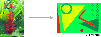
Here's how my assignment was supposed to look like

oh how i wish it actually turned out like this D;
i'm pretty sure my points for this assignment are ...i don't really want to think about it..so i wont >_< meh. that's it for now. this post has a lot less pictures and a whole lot of words compared to my other posts. so goodbaiiiiiiii~
for now. xD

Sunday, 7 October 2012

Colours~

Hello again :D During our Monday class, Miss Lisa explained to us about the colour wheel and how important colours are in design. Colours not only give off a certain mood when looked at, it sometimes also reflects our mood. Example, if you wore a yellow coloured shirt, it could mean you're in a good mood. Or black, because you felt serious, sophisticated.

Upon my research on colour wheels, i stumbled across colormatters.com a website which seemed to have similar informations to Miss Lisa's slide. So i took most of the pictures and information below from there.
The colour wheel, or circular diagram of colours, was first developed by Sir Isaac Newton in 1666. Then other scientists as well as artists have designed several other variations of this concept.

 There are 3 main colour wheels which are:
→ Primary colours cant be mixed/formed by any combination of other colours
→ Secondary colours are formed by mixing primary colours
→ Tertiary colours are formed by mixing a primary and secondary colour together

Colour Harmony:
A color scheme based on analogous colours
   They're 3 colours side by side on a 12-part colour wheel. Usually one colour predominates.

○ A colour scheme based on complementary colours
   These are 2 colours that are completely opposite of one another. They create maximum contrast      and stability.

○ A colour scheme based on nature

I saw this picture on the page and just had to take it xD it seemed so cute
The yellow colour shows dominance over the blue

Yup, that's about it for summarizing what Miss Lisa taught that day.
After that, we were assigned to use 8 colours listed in the slide (black, grey, white, red, blue, purple, brown and pink) and different types of  words and also suitable fonts used to describe the colour. With our name as the last word, we had to choose a colour, together with a font that represented ourself. My assignment was fine at first, but later turned out to being a total disaster. Why? Read the next post. :P