Upon my research on colour wheels, i stumbled across colormatters.com a website which seemed to have similar informations to Miss Lisa's slide. So i took most of the pictures and information below from there.
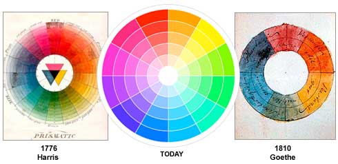
The colour wheel, or circular diagram of colours, was first developed by Sir Isaac Newton in 1666. Then other scientists as well as artists have designed several other variations of this concept.
There are 3 main colour wheels which are:
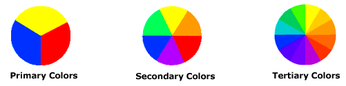
→ Secondary colours are formed by mixing primary colours
→ Tertiary colours are formed by mixing a primary and secondary colour together
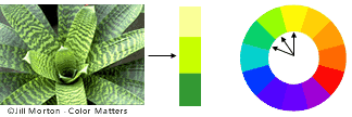
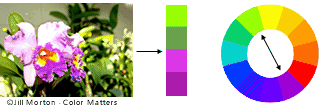
Colour Harmony:
○ A color scheme based on analogous colours
They're 3 colours side by side on a 12-part colour wheel. Usually one colour predominates.
○ A colour scheme based on complementary colours
These are 2 colours that are completely opposite of one another. They create maximum contrast and stability.
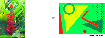
○ A colour scheme based on nature
I saw this picture on the page and just had to take it xD it seemed so cute
The yellow colour shows dominance over the blue
Yup, that's about it for summarizing what Miss Lisa taught that day.
After that, we were assigned to use 8 colours listed in the slide (black, grey, white, red, blue, purple, brown and pink) and different types of words and also suitable fonts used to describe the colour. With our name as the last word, we had to choose a colour, together with a font that represented ourself. My assignment was fine at first, but later turned out to being a total disaster. Why? Read the next post. :P
No comments:
Post a Comment